Hannah Dunscombe
  • Artwork
    • Comics >
      • Key Limes
      • A Case of You
      • Fynn
    • Painting >
      • 2013–2014
      • 2012
      • 2010–2011
      • Traditional
      • Commissions
      • Painting Timelines
    • On Paper >
      • Drawn Portraits
      • Illustrations
      • Sketchbook >
        • Paris 2019
        • Rotterdam 2019
        • Warsaw 2019
        • Paris 2015
        • 2012–2014
        • On the farm 2012
        • Upstate New York 2012
        • Paris 2011
        • Daily
  • Photography
    • Travel Photography >
      • Alfred
      • New York
      • New England
      • Florida
      • Paris
      • Normandy
      • Provence
      • Central France
      • Rotterdam
      • Vienna
      • Warsaw
      • In Flight
    • Event Photography >
      • Wedding >
        • Alex & Ron
        • Jamie & Chris
        • Rachel & Nick
        • Deidre & Sam
        • Jess & Sam
        • Katie & Lukas
        • Eggy & Thomas
        • Diana & Nate
        • Kristine & Andy
        • Brittany & Bill
        • Allie & Michael
        • Christiane & Kristopher
        • Bellmary & Andy
      • Athletic
      • Concert
      • Corporate
      • Protest
    • Marketing Photography >
      • Retail >
        • HBP Catalog & Advertising
        • HBP Location & Staff
        • HBP 40th Anniversary Campaign
      • Album Artwork
      • Cambridge Coworking
  • Blog
  • About
    • Background
    • Commission
    • CV
  • Contact

Mixing oil paint video + in progress painting

4/14/2013

0 Comments

 
I remixed some of my older paints today and made a short video of the process.  Because I only use a tiny dollop of each color every day, I make just enough paint to fill canisters that are about the diameter of a quarter.  There's no need to make more than I'll use in a couple month's time, and that way I continually make myself freshly mixed batches of color.
I find that with certain colors it's better to add a little extra linseed oil or the paint develops a crust after a few weeks, rendering it unusable and a waste.  The extra oil just means that I need to stir the paint every so often to prevent it from settling and congealing.  The texture is like commercial oil paint diluted with linseed oil to make it creamier and less pasty.

Every color mixes differently.  Titanium white pigment sinks into the oil almost immediately, so it is very easy to overdo it and make it too milky.  It can still be usable like this, but it's a slippery slope.  Colors that you've mixed with a highly diluted white may seem the right hue when you apply the paint, but it can dry much darker and you may waste time having to go back and fine tune the luminosity.  On the other hand, yellow ochre takes longer to absorb the oil, so you have to be patient and allow the pigment to catch up while mixing.  You can see that I added oil to the white only a few times and quite sparingly, while with the yellow I added it incrementally and over a longer period of time. The white ends up being light and whippable, while only toward the end does the yellow reveal all the oil I've added, shifting to a heavy, soupy consistency.

Although I can control the outcome to an extent, the consistencies are largely inherent in each pigment's properties.  So for instance, cadmium red tends to be very easy to mix and turns out almost the consistency of soft butter.  Ultramarine blue is the opposite.  It is definitely the hardest to mix and the most difficult to keep.  The pigment tends to dissolve and float in the oil almost instantly, but as soon as it goes in the canister it separates and hardens at the bottom like a cake of cement. It requires a lot of upkeep and constant remixing, though luckily it is very potent and it doesn't take much to do the job when mixing with other colors.

Here's the shorter version with white.
A little more painting nerd talk, for the last two years I've been using pigments from Sinopia Pigments, a company based out of San Francisco.  They have a great selection of high quality pigments and binders.  I invested roughly $100 in my current palette of 13 colors and cold-pressed linseed oil from Sinopia back in 2011, and I've only recently run out of yellow ochre and white.  Using pigments is a very cost effective way to be a painter because you typically get more colors to choose from, the pigments are pure and higher quality, and you can hold onto a jar or bag for years at a time.  You can also make watercolor with the same pigments and gum arabic diluted in water.  Even egg tempera, wax, or acrylic paint if that's your bag.  Of course, my paintings are pretty small, so I can get by on a 75g jar ($20.00) of cadmium red medium for years, whereas larger-scale painters might need a 500g bag ($85.00) for it to last as long. Cadmium red is my priciest color though, so don't let that scare you. A 75g jar of yellow ochre can start as low as $8.00 and 500g at $17.00.

I'd look into Kremer Pigments as well, which is based out of New York City (and was featured in the Radiolab about color!) I once ordered some Cellulose glue and Damar gum from them and received both only a couple days later.  Their prices run about the same as Sinopia, and because they are on my side of the country, I can probably expect them to arrive a little sooner than Sinopia if I'm in a pinch.  I did cave and pick up a cheap jar of titanium white at Utrecht recently, though I wouldn't recommend Utrecht for all your pigments.  The stores don't generally carry any pigments beyond your basic rainbow.
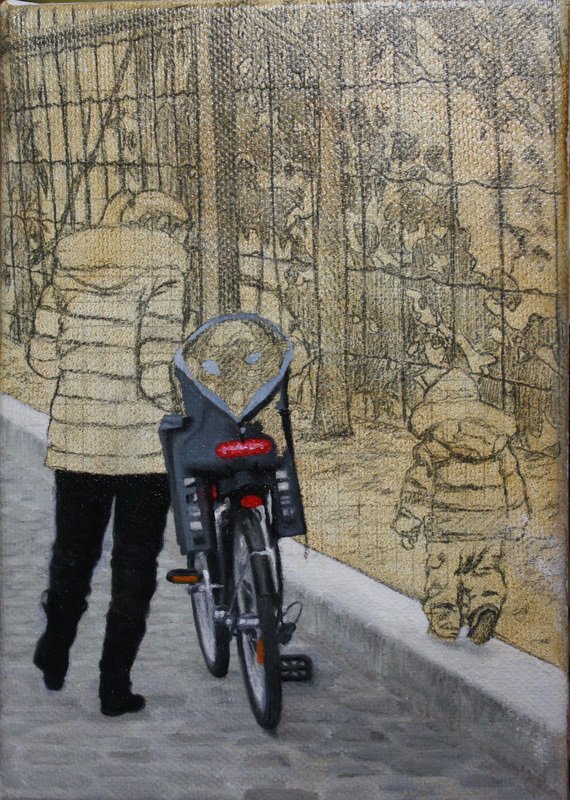
Anyway, the above paint will be going on the below painting.  The foreground is very wintery but the background will be springy. Stay tuned.
Picture
0 Comments


Leave a Reply.

    Artist

    Hannah Dunscombe is a painter and portrait artist based out of Mansfield, MA.

    Picture

    Categories

    All
    Baking/cooking
    Biking
    Boston
    Boston Music
    Ceramics
    Collaboration
    College
    Comics
    Commissions
    Construction
    Day Job
    Decorating
    Design
    Detroit
    Drawing
    Excerpts
    Exhibition
    Family
    Food
    French
    Friends
    Health
    Home Improvement
    Illustration
    Memories
    Mfa Boston
    Museums
    Music
    Nail Art
    Nature
    New England
    New York
    Northern Renaissance
    Oil Paintings
    Other Blogs
    Painted Portraits
    Pets
    Photography
    Plants
    Raw Materials
    Running
    Sketchbooks
    Technique
    Text
    Travel
    Video
    Watercolor
    Wedding
    Window Painting
    Work In Progress
    Writing

    Archives

    February 2021
    December 2020
    November 2020
    October 2020
    September 2020
    July 2020
    June 2020
    May 2020
    April 2020
    March 2020
    February 2020
    January 2020
    December 2019
    November 2019
    October 2019
    September 2019
    August 2019
    July 2019
    June 2019
    May 2019
    April 2019
    March 2019
    February 2019
    January 2019
    December 2018
    November 2018
    October 2018
    September 2018
    August 2018
    July 2018
    June 2018
    May 2018
    April 2018
    March 2018
    February 2018
    January 2018
    December 2017
    November 2017
    October 2017
    September 2017
    August 2017
    July 2017
    June 2017
    May 2017
    April 2017
    February 2017
    December 2016
    November 2016
    October 2016
    September 2016
    July 2016
    May 2016
    April 2016
    March 2016
    February 2016
    January 2016
    December 2015
    November 2015
    October 2015
    May 2015
    April 2015
    March 2015
    February 2015
    January 2015
    November 2014
    October 2014
    September 2014
    June 2014
    May 2014
    April 2014
    March 2014
    February 2014
    December 2013
    October 2013
    September 2013
    July 2013
    June 2013
    May 2013
    April 2013
    March 2013
    February 2013
    January 2013
    December 2012

©2021 Hannah Dunscombe
  • Artwork
    • Comics >
      • Key Limes
      • A Case of You
      • Fynn
    • Painting >
      • 2013–2014
      • 2012
      • 2010–2011
      • Traditional
      • Commissions
      • Painting Timelines
    • On Paper >
      • Drawn Portraits
      • Illustrations
      • Sketchbook >
        • Paris 2019
        • Rotterdam 2019
        • Warsaw 2019
        • Paris 2015
        • 2012–2014
        • On the farm 2012
        • Upstate New York 2012
        • Paris 2011
        • Daily
  • Photography
    • Travel Photography >
      • Alfred
      • New York
      • New England
      • Florida
      • Paris
      • Normandy
      • Provence
      • Central France
      • Rotterdam
      • Vienna
      • Warsaw
      • In Flight
    • Event Photography >
      • Wedding >
        • Alex & Ron
        • Jamie & Chris
        • Rachel & Nick
        • Deidre & Sam
        • Jess & Sam
        • Katie & Lukas
        • Eggy & Thomas
        • Diana & Nate
        • Kristine & Andy
        • Brittany & Bill
        • Allie & Michael
        • Christiane & Kristopher
        • Bellmary & Andy
      • Athletic
      • Concert
      • Corporate
      • Protest
    • Marketing Photography >
      • Retail >
        • HBP Catalog & Advertising
        • HBP Location & Staff
        • HBP 40th Anniversary Campaign
      • Album Artwork
      • Cambridge Coworking
  • Blog
  • About
    • Background
    • Commission
    • CV
  • Contact